
In case you haven’t heard, Twitter just got a makeover. The new layout is being rolled out and offered to users right now, but eventually everyone will be on the new look. The upgraded design looks like a combination of Facebook and Google+ to me. The most notable change is the larger header image that seems “inspired” by the Facebook Timeline Cover design. There are also some other changes like your profile pic is bigger, the backgrounds are gone, your “about” section is off to the side, and some functionality changes too.
Like any change to a social media site, there was plenty of debate on whether or not the change is better. But like it or not, Twitter users are going to have to get used to it because it’s not going anywhere anytime soon. Just like with all of the changes to Facebook, marketers will have to adjust and learn how to use the new layout to their advantage. Here’s what social media marketers need to know about Twitter’s new layout.
Bye-bye background marketing
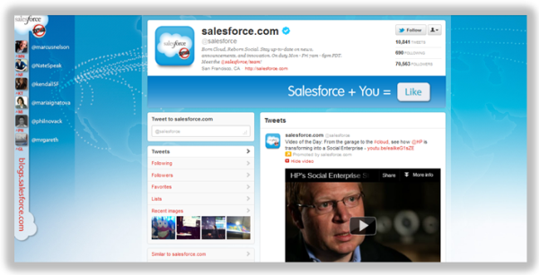
With the old layout, marketers could get creative with the background of their profile. Here’s an example of how Salesforce utilized the background space to push traffic to their blog and highlight some of their employees they wanted you to follow.
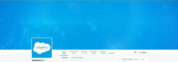
Since that valuable real estate is gone now, you’re going to have to start making use of the new large sized header space. I guess Salesforce hasn’t had the time to update yet, because here’s what their page looks like with the new layout.
So if you were using the background to market, you’re going to have to think of something new. Luckily the new header has plenty of space to splatter your message across.
You get a billboard!
Even though you don’t have the background anymore, the larger sized header is like a huge billboard for you to catch the eyes of people who come across your page.
A huge benefit of the new header over the old backgrounds is that they’re sized nicely. The problem a lot of marketers had with using the background space was that they looked different depending on what size screen people used. For instance, here’s Snapple’s Twitter page from my 15.6 inch laptop screen:
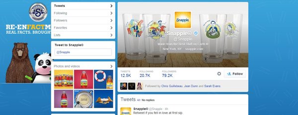
Notice how the background doesn’t show completely. I have to zoom out in order to see the full image. You don’t have to worry about that with the new layout, because the full header shows up just fine on different size screens.
You will have to change your header image though. When you first make the switch to the new layout, Twitter will automatically use the image you have for your current header, which probably isn’t sized correctly.
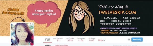
Twitter recommends using an image sized 1500×500. But Pauline Cabrera recommends going slightly smaller at 1500×421. That link also has a downloadable template you can use to setup your profile with the new layout. Pauline is making great use of the new billboard sized header (I need to take some lessons from her!)
Pin Tweets
One cool feature that came along with the new Twitter layout is the ability to pin tweets. This doesn’t have anything to do with Pinterest though. Now, you can choose any of your tweets to be pinned at the top of your profile. Any new tweets will show up underneath the pinned one.
This is great for marketers because it’s like Twitter’s promoted tweets for your personal profile. So if you have a certain blog post that you want people to see, you can pin a tweet with the link to it for everyone who comes to your page to see. Since Twitter moves so quickly, a lot of the tweets that you felt were really good probably got overlooked. Now you don’t have to worry about your best content getting lost in the static. Just pin it!
Emphasis on quality
Every single online marketing related site has been preaching about the importance of putting out high quality content forever. Well Twitter is making quality content a priority too. Now, your most popular tweets (the ones that have been retweeted, clicked, etc.) will be highlighted on your timeline.
Not only does this help encourage people to share intriguing content that people actually want to read, but it also makes it easier for you to quickly check which tweets are the most popular just by browsing your timeline.
It won’t matter until they upgrade the mobile apps
Most people use Twitter on mobile devices, which doesn’t display the new layout (yet). Supposedly Twitter is planning on updating the mobile app. But until that happens, it’s going to be hard to gauge whether or not the changes are beneficial or not for marketers.
My suggestion is to start getting familiar with the new layout and some of the new features now. By the time the mobile app gets updated, you’ll have a good idea of how to make use of the larger displayed tweets, and newly placed emphasis on content.
For more info on the new changes to Twitter, here’s an article from Gordon Kelly on Forbes that should steer you in the right direction.


