
Last week I created my first SlideShare presentation ever. I had absolutely NO following on SlideShare. I’m not some “big brand”. I’m not famous. I have extremely limited graphic design skills. Despite all of that, my presentation got featured.
If you follow me on Twitter (shame on you if you don’t) then you probably saw me tweeting out the link to the presentation like crazy. Being my first ever experience with SlideShare, I didn’t entirely know what to expect. I was confident that the content I was going to write for the slides would be good, but since I’m not really a graphic design type of guy, this was either going to be a total fail, or a pleasant success.
Not only was it a success, but it did much better than I could have imagined. It got plenty of Twitter mentions, and even landed in the featured section of the home page.
When I received the email from SlideShare that my presentation was going to be featured, I was very excited to say the least. I’ve had successful blog posts before, but like I said, this was new terrain for me. Now that the initial excitement has calmed down, I’ve had the opportunity to really reflect on my first experience with SlideShare.
I’m going to share with you my process for making the SlideShare presentation, what I did right, and even some of the things I could have done better.
But first, here’s my presentation that I’ll be referencing.
What Is SlideShare?
Before I get into the details of my SlideShare campaign, I think it’s important for you to get a feel for what SlideShare is. It’ll help you get the right mindset to create your slides, and give you a better chance of success. Also, some of you may be like my brother and never heard of SlideShare before, so I don’t want you to feel left out!
In essence, SlideShare is a community for slideshow presentations. They’ve also expanded to videos, and infographics, but the core of it is slideshows. It’s owned by LinkedIn, so naturally their audience consists of a lot of professionals. A quick glimpse at the presentations listed on the home page will probably give you a good feel for the type of content that’s popular on the site.
The slide presentations that you put together are also referred to as “decks” by some people. So when you see me say “SlideShare deck” like in the beginning of this post, it’s just another way of saying my presentation.
The reason why I like SlideShare and decided to add it into my content marketing strategy is because it combines visuals and written content. I’ll go into more detail later on, but visuals are a HUGE part of a good SlideShare deck. I’m a firm believer that if you really want to be a great content marketer or master inbound marketing, you can’t just rely on text. SlideShare gives you a nice platform to intensify your written content with slides.
That’s my crash course on SlideShare. If I didn’t convince you to give it a try, here’s a deck made by SlideShare:
Now, onto the part that you most likely came here for. Let’s get into the meat and potatoes. Let’s really dig in and take a look at how to put together an awesome SlideShare presentation.
Step 1: Forming Your Idea
My very first step when creating my SlideShare Presentation was sitting down and brainstorming ideas of what I could make a compelling presentation about. Ironically enough, this is something that’s mentioned in the deck I eventually made.
The thing about SlideShare decks is that the topic you pick should be something that can be explained clearly, but in bite sized chunks. My first idea was to re-purpose one of my existing blog posts and turn it into a presentation. Re-purposing old blog posts is a very good way to create decks, especially if you have a particular blog post that was popular. When I was toying around with this idea, my first thought was to use my “Are You Making These 5 Twitter Marketing Mistakes” post. But I had already turned that into an infographic, and really wanted to offer something different this time around.
So I started digging deeper. I thought about what I wanted this presentation to do. And when I really thought about it, I wanted it to help me build my authority as a content marketer, and grow awareness of my site/brand. What better way to do that then to pick a topic that I knew people tend to struggle with, and that I could give some good, actionable advice on.
But I didn’t just want to give some overarching theme, or general advice. Since I was making a slideshow, I would be able to make it into a sequence that people would have to follow in order, just like pages of a book. That gave me the idea of making my presentation a “how to” guide.
With all of this information, here’s where I was at: I wanted to make some sort of guide with actionable content, that would showcase my authority by solving a common pain point that my target audience experiences.
Using that, I formulated my idea. A guide about creating blog posts. Once I had my idea, I moved onto my next step.
What you can take from this step:
- Brainstorm ideas of what you want to write about. No idea is too dumb, put it all out there.
- Come up with a goal for what you want your presentation to do. (build your authority, entertain, get email subscribers, etc.)
- Draw a connection between the ideas you brainstormed and your goal
- Make sure your idea can be made into bite-sized chunks
- Consider re-purposing one of your old blog posts
- The more specific you can get with your idea, the better
- Combine all those steps into a single presentation topic
Step 2: Coming Up With A Title For Your SlideShare Presentation
Now that I had my idea in my head, I had to turn it into a real thing. That meant coming up with a title, and “theme” for my presentation. What I mean by theme is what your presentation will have to make it stand out. There are a ton of blog posts, and even SlideShare presentation on the topic of creating blog posts. So going with a title like “How To Make A Good Blog Post” wasn’t going to do it. The writer and content marketer in me started to come out now.
This step is vital, and I knew I had to come up with something good in order to make my presentation special or it would get overlooked. This is when my theme started to formulate. One of the first things I noticed when I was looking through blog posts and other content related to the topic of making an enticing blog post was that they tended to be really long and in depth. Even a lot of the SlideShare presentations I was seeing were 80+ slides long in some cases.
That’s when it hit me. What if instead of doing one of these mega walk-through guides, I could make something short and right to the point. No filler. No fluff. Just the information my audience absolutely needed. Like I’ve mentioned before, word count and length are not always requirements of great content. So I had my differentiator. I was going to make a short and sweet guide to building a blog post.
But I dug deeper (starting to see a theme developing here?)
I didn’t just want to make a short guide to creating a good blog post. That wasn’t descriptive enough for me. I said to myself “SELF, what’s the most eye-catching and engaging way you describe this presentation you’re about to create?” I encourage you all to talk to yourself whenever possible by the way. People may think you’re weird, but it’s the cost of being creative!
From there, I broke it down piece by piece.
“The Short Guide To Creating A Good Blog Post”
I started with “short guide”. People like short reads because they’re able to get through them QUICKLY. And when I thought of the word quick, the phrase “quick and dirty” just sounded right and captured the point I was trying to get across.
Then I moved onto “creating a good blog post”. Talk about BOORRINNGGG! So again, I started thinking of what someone looking for this type of guide really wanted, while keeping the goals I mentioned earlier in mind. I wanted to prove my authority and give people information that they could really use. The word “good” didn’t capture that. People want to know how to make blog posts that people actually want to read, in order to build their traffic and grow their income. They want to reach their starving audience. Voila, the second part of the title came to my mind, “creating blog posts that your audience CRAVES”.
The word Craves was really important for my title. For people seeing my SlideShare presentation, it signifies to them that I’m not just going to show them how to write any old blog post. If they watch this presentation, they’re going to learn how to build the type of content that people are starving for.
Put it all together, and you have:
The Quick And Dirty Guide To Creating Blog Posts That Your Audience Craves
Here are the key takeaways from this step:
- Develop a “theme” for your presentation to set it apart
- Look at SlideShare decks on similar topics. What can you do differently?
- Create a “base” title that clearly explains what your deck will be about
- Break down the different parts of you “base” title, and amplify each piece using engaging descriptors
- Make sure your title grabs people’s attention right away, even if it means being a little controversial
- Your presentation title is crucial, spend a good amount of time crafting something amazing
Step 3: Creating An Outline For Your SlideShare Presentation
You have your title, concept, message you want to convey, and an overall theme for your presentation. This next step seems to be where a lot of people slip up. They start putting together their presentation at this point. I’m not going to lie, I almost did the same thing. I had an idea for what I wanted to write, so I figured I’d just make it up as I went along designing the slides. But thanks to a few different guides I read on creating presentations, and even some lessons I learned back in middle and high school, I went a different route. I made an outline and draft first.
Remember back in school when your teachers used to tell you to brainstorm, create a rough draft, edit that draft, and then write your final version? If you’re like me, you probably skipped the first two steps, wrote ONE version, looked it over and turned it in. Well, that approach might work sometimes, but after years of putting together A LOT of content, I’ve really been able to see the value in doing outlines and drafts. Especially when you’re putting together a presentation or any type of larger piece of content.
Creating an outline lets you:
- Plan out how many slides you want
- Organize the sequence of your presentation
- Make sure you’re not missing any important parts
- Arrange the wording that you want
- Get a complete view of ALL the content you’re going to be adding
- Easily transfer over the content from your outline into your slides so all you have to worry about when it’s time to put your presentation together is the way it looks
Think of this process like cooking a meal. Putting the words together before creating the slides is like prepping your veggies and ingredients before you start cooking. If you just start cooking without having the vegetables cut up, or your seasonings laid out for you, then making your dinner becomes a lot more hectic and difficult than it should be. But when everything is prepped and ready to go, all you have to do is put it all together and cook it up! The same thing goes for your SlideShare deck.
For my presentation, I made my outline in Google Docs, nothing fancy. I started by thinking of the process that I wanted to walk people through in order to create an amazing blog post. For any type of guide, getting the steps in order is very important. Which is another reason it was so important for me to do an outline BEFORE putting the slides together.
I started writing down the process I go through when making a blog post. Again, nothing fancy here. Just get the ideas written down. Once I had all the steps written down, I started to add in some of the extra tidbits. For instance, I knew I wanted some type of intro to warm people up to what they were going to be reading. I’ve seen slides where the intro is about 10 slides worth of nonsense. I didn’t want that. Remember, this is a quick and dirty guide, not an in depth research paper. I decided I wanted to make my introductory slide a statistic.
Statistics are great because people like facts. I can scream until my throat gets sore about how effective blogging could be. But by giving the readers data and numbers, it becomes real. Stats also entice people to keep reading further, so it’s never a bad idea to include them in your slide deck.
I wrote down a few more ideas for slides to lead into the meat of the content just to really pull people in. At this point, I had a mix of sentences, lists, and general points to include. I took that info and formed it into the words I wanted to put into my slide so that all I had to do was copy and paste. I didn’t want to have to worry about writing content while I was putting the slides together. Again, prepping saves you time.
Something important to mention here is that writing for slides is different than for a blog post, eBook, or other types of content. It’s almost like writing in bullet points. You have to get your point across quickly, and in as few words as possible. I once had a professor tell me that if your slides have more than a sentence on them, they’re too long. While he may have been exaggerating a little bit, he actually wasn’t too far off.
Nothing is more of a buzz kill than seeing a ton of slides with long paragraphs on them. Good slides present content in small bite sized chunks. Think of content like this:
- Guides/eBooks = Reese’s Big Cup
- Blog posts = Reese’s Cups
- Slides = Reese’s Pieces
And those promotional blog posts that nobody reads are dark chocolate Reese’s because nobody likes them (just kidding. Please don’t sue me Reese’s!)

The long detailed sentences you write for blog posts don’t tend to translate well into slides, which is where a lot of presentations fail. A good tip for certain points that might take a few sentences to get across is to break them up into two slides. For instance, let’s look at slides #3 and #4 in my presentation:


When you combine them, they say “But blogging only works if you’re creating blog posts that your audience craves”. It’s not a horrendously long sentence, but look how much more of an impact the message has when I break it up into two separate slides as opposed to putting them both in one. Not only does it make a difference visually, but also in the suspense and buildup of going from slide #3 to #4.
[Tweet “#SLIDESHARE Tip: Make your slides more like Reese’s Pieces than Reese’s Cups!”]
Here’s my finalized version of the draft for my SlideShare Deck. Check it out!
There are a few things you’ll probably notice, especially if you compare it to my published SlideShare deck. Some of the content from my deck isn’t in my draft. That’s because I decided to make a few small changes once I started putting everything together. But the content there is pretty much exactly what I put into the presentation.
Another thing you’ll notice is that I sequenced my presentation in the draft. I highly suggest putting your outline in the order you want your presentation to be in. It’s a huge time saver.
Here are the key takeaways for you from this step:
- Create a draft for your presentation in a separate document (Google Docs, Word, or even Notepad)
- Write out all of the points you want to mention in your presentation
- Turn those points into sentences and phrases that you can put on your slides
- Write down what you want to include for your introductory slides (statistics work well)
- Sequence the content in the order you want it to appear in your presentation
- Make your outline as easy to copy/paste directly into your slides as possible
- The content of your slides should be short and sweet. Think Reese’s Pieces, not Reese’s Cups
- Feel free to make changes to your outline once you start putting your presentation together
Step 4: Creating Your Slides & Adding Visuals
Despite the fact that I’m about as far from a graphics guy as you can get, this was my favorite part of the process. Because although I definitely won’t win any graphic design contests, I enjoy doing creative things. And putting together a slideshow takes a good deal of creativity.
Up to this point in the process, you’ll notice I haven’t even mentioned opening up a program to work on your presentation yet. That’s because until now, there really is no reason to. You’ve been laying the groundwork for your slides so that this step is a lot quicker and easier on you.
Unlike with the writing portion where I laid out everything ahead of time, I looked for my visuals while I was putting the slides together. I took this route because:
- This workflow seemed to work well for me
- The program I was using to create the Slides has graphics and images built in, so I knew I was going to rely on those a good amount
I used Canva to make my presentation. For those of you who don’t know, Canva is the best thing since sliced bread. It’s a 100% free tool that lets you create all types of graphics from social media headers, to ads, infogrpahics, and more. In fact, it’s what I started using in order to make the graphics for my site!
There are a lot of different tools out there you can use to make your Slideshare presentation like Photoshop, Power Point, Google Slides, and even Slideshare’s built in tool. But here’s why I decided to go with Canva:
- It’s free
- The sizing is already made for you, so no worries on funky looking slides
- The drag & drop interface is SUPER easy to use
- They have a huge library of graphics/icons/illustrations to add to your slides
- I don’t have to download any software
- A good selection of fonts
- No watermarks on your content
- The final output quality is great
Feel free to use whatever you feel most comfortable with, but I 100% recommend Canva. The only downside to Canva is that they limit you to 30 slides for your presentation. I didn’t know this when I started, so when I got to slide number 30, I still needed to make about 2-3 more slides so I was forced to condense a couple of the slides to stay under the limit. While that was a little inconvenient, it’s kind of advantageous for me because like I mentioned, I prefer shorter slideshow presentations. But if there was a paid option to allow you to do unlimited slides, I’d definitely sign up.
Onto putting the slides together.
The first step was to make my front page. Your front page should have the title of your presentation, and some type of graphic to pull people’s eyes in. Since my title was “Quick & Dirty”, I immediately knew I wanted something with mud or dirt. Originally I was going to find an image of muddy grass or some type of landscape. But I knew if I wanted to really catch people’s eye, a nature picture wasn’t going to do it.
I decided that I wanted a person in the featured image. And since images with women perform better than ones with men, it was a pretty simple choice.
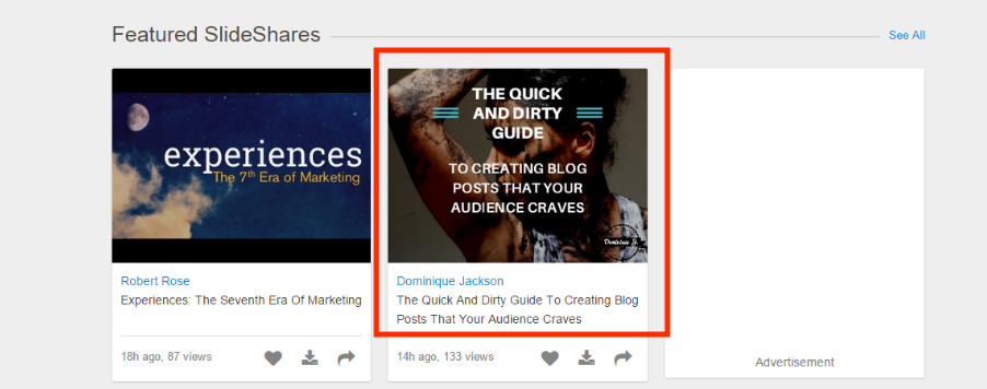
So I decided that I wanted an image of a female that with mud. The challenge was finding an image that wasn’t perverted or X-rated (which I realize is a lot to ask for when searching for images of a female in mud), but was enticing. Here’s the image I went with:

A couple of tips for using stock photos.
- Avoid the ridiculously generic looking ones
- Find one that makes sense for the message you’re trying to convey
- Use high quality pictures, not stretched out, pixelated images
As you can see, I added filtering onto the image to get it to look the way I wanted. It was mainly to really emphasize the title of my presentation. The most important thing to remember is that you want to make something that stands out. Even though you shouldn’t judge a book by it’s cover, that’s exactly what people tend to do when choosing which slideshows to watch. So make sure your cover makes a fantastic first impression.
I used this first slide to set the color scheme for the rest of my presentation. There were a lot of grey tones in it, so I carried that out through the rest of presentation. A lot of the best slideshows I looked at on Slideshare, many of which came from HubSpot, tended to have a general color scheme that stayed consistent throughout the presentation.
Staying consistent with your colors makes your presentation look more concise, professional, and really gel together well. Another thing to consider is your font. Graphic designers tend to be really good at picking the right type of font for different projects. If you’re like me and not a graphic designer, use your best judgement. Don’t pick some funky, crazy looking font that’s barely readable. And just like your color scheme, your font should be consistent too. Don’t use Comic sans on one slide, Helvetica on the next, and then a crazy looking Gothic font on the one after.
A good tip to get some variety in your font without going overboard is to use a font that has different variations. I’m sure there’s a technical term for this, but like I said, I’m not a graphic guy. For instance, the font I used for my presentation is called Aileron. But I used 3 different variations of Aileron:

And then I used bold in some instances for headings and emphasis. It lets you add some flavor to your slides without having a messy, unprofessional presentation.
With this info in mind, the only thing left to do is start putting together your slides. My presentation had two types of slides:
- Plain background
- Image background
I did this because if I had just made all my slides with the plain dark background + font and a few graphics, it would have been boring. By adding in high quality images on some of your slides, it keeps people engaged and adds splashes of flavor to your presentation. There’s no ratio or formula to follow here. It’s just something you have to be conscious of when putting together your presentation. I tried not to go more than 3-4 slides without an image background.
Lastly, put some type of call to action on your last slide. If people have gotten all the way through to the end, there’s a good chance they found your presentation at least a little bit interesting. Take advantage of that by pushing traffic towards your website or even some type of email subscribe form. SlideShare has the ability to integrate email signup forms within your presentation.
Don’t forget to brand your presentation! I did this by placing my badge in the lower right hand corner of every slide. I suggest placing your website URL, business name, or any other type of identifier you can have in a corner of your slide. You don’t want to make it a focal point of the slides, but it should be noticeable so that people realize you made it.
Your key takeaways for this step:
- Your front slide should make a statement. Get BOLD!
- Choose a consistent color scheme
- Limit yourself to 1-2 fonts. Use variations of the same font to mix it up, while still being consistent
- Only use professional looking, high quality stock photos
- Use a mix of solid background slides, and image background slides
- Brand your slides with your website URL or logo
- Include a call to action on the last slide
Step 5: Publishing and Promoting Your SlideShare Deck
Once you’ve put everything together, go back and look for any spelling mistakes. I’ve seen a good deal of slides that are filled with spelling issues, which is a quick way to turn people off. If everything looks good, export it and upload it to SlideShare. If you’re using Canva, all you have to do is click “Download” and choose “High Quality PDF”.
When it’s time to upload your presentation, make sure that you fill out all the information like the tags and description. SlideShare has a little meter off to the side to tell you how discoverable your presentation will be based on the amount of information you enter. Aim to fill up the entire bar. Apparently the more keywords you enter, the better. According to SlideShare:
[Tweet “#SLIDESHARE TIP: Add up to 20 keywords to increase discoverability by 30%”]
After publishing your SlideShare deck, it’s time to get the word out. My main way of doing this was Twitter. I tweeted out the link to my presentation throughout the day, and I’m still tweeting about it because you have to constantly promote your content.
With the tweets I sent out and organic traffic, I was starting to get some views. And then BOOM! SlideShare put my presentation on the front page and my number of views shot up. Not only was my deck front and center on the home page of the site which gets thousands of views each day, but SlideShare tweeted the link to the presentation multiple times to their 200K+ followers which got me even more attention. And then people starting tweeting out the link on their personal Twitter pages, and sharing it on LinkedIn, which helped a lot too. The point I’m getting at is that it spread through social media and other people talking about it more-so than just the tweets I sent out.
How to create blog posts your audience craves, via @djthewriter: http://t.co/VSvENVdbAB pic.twitter.com/Jjzr8Ujl3d
— SlideShare (@SlideShare) April 2, 2015
I was quick to favorite, retweet, and thank all of the people who tweeted links to the presentation, which I highly recommend you do anytime people share your content on Twitter or other social sites. With millions of pieces of content floating around the web, someone singling out your blog post, SlideShare presentation or other content and sharing it with their network is something to be appreciated. Take a few seconds to thank people who share your stuff, it helps!
I’ll go more into detail on some tips you can use to promote your SlideShare presentation in the next step, but here are the key takeaways for this section:
- Optimize your SlideShare uploads with a good description, the right category, and plenty of keywords
- Share your presentation on social media multiple times, not just once!
- Acknowledge and respond to people who share links to your presentation
What I Could Have Done Differently!
Now that I outlined exactly everything I did, and my thought process while I created my presentation, I want to talk a little bit about what I could have done better, and give some extra tips on how to promote your SlideShare presentation.
One of the biggest regrets I have is using my badge in the corner of each slide. SlideShare didn’t upload my slides properly so the text on the badge is scrambled, specifically the part with the URL of my website, which sucks. For my future presentations, I’ll make sure I just type out the URL of my site and have the badge on the last slide. It’s just easier.
Another mistake I made was on my last slide. I put the URL to my site on it, and when you click on it, it takes you to my website. The problem is that there’s no way of telling that it’s a link unless you randomly decide to click on it. Which explains why I have so few clicks on that link (after about 3 days, I had less than 10 clicks on that link).
If I would have made it clear that the text was clickable with a call to action like “Visit my site here!” with an arrow pointing to it, or even made it into a button, I would definitely get more clicks to that link. Since I didn’t, the traffic I got from the presentation is from people who just typed in the URL and came directly to my site.
I considered going back and making some of these changes, but I decided to leave it as-is to showcase some of the hits and missed I had. What better way for you to learn than to see a real life example of what I created?
How To Promote Your SlideShare Presentation
Promoting your SlideShare presentation is very important, so I want to give you some more great tips on how you can get more views on SlideShare:
- @mention anyone or brands you mentioned in your presentation. I used this strategy with my blog posts on online marketing tools and it really helped it gain popularity.
- Embed the presentation on any sites you have access to. I have a few different sites like Blogger, Tumblr, and Weebly that I embeded the presentation to. Also embed it in any blog posts on your main site when it’s relevant.
- Make sure you share it on LinkedIn. You can link your LinkedIn and SlideShare accounts so that all of your presentation are automatically shared with your connections, and also included on your profile.
- Comment on other presentations. Search for existing SlideShare presentations similar to yours and drop a comment. The presenters see it, and so do other viewers. Don’t spam though!
- Optimize for long tail searches. Use this free tool to look for different long-tail phrases related to your presentation’s topic. Include the phrases in the description and even as keywords.
- Link to it on guest posts. Instead of posting a link to your website in guest posts, link to your SlideShare presentation. Free and easy traffic.
- Make an amazing presentation. Above all else, your presentation has to be great. This is what worked for me. If you take the time to put together a great SlideShare presentation, and optimize it, there’s a good chance you’ll see some success.
If you follow those steps, you’ll be able to get a good amount of traffic to your presentation. But you have to put in the work.
Last Notes
As I wrap up this monster 5,000+ word post, I want to give you some key takeaways. First, here is my 5 step process for creating a killer SlideShare presentation:

And some tips to keep in mind to make your presentation a success:
- Focus on quality!
- Plan out your content
- Don’t be generic and bland, get creative
- Your presentation Title is CRUCIAL, put some thought into it
- Keep the content short and sweet. Reese’s Pieces!
- Be consistent with your color scheme and font, this isn’t an old school Myspace page
- Promote your presentation like crazy
SlideShare is definitely going to become a regular part of my content marketing efforts. I’m not dillusional. Not every one of my future SlideShare decks will be a hit, or get featured. But I saw a nice boost in traffic, gained some new followers, and helped build my authority by putting out a great piece of content. If you haven’t considered making SlideShare a part of your content marketing efforts, give it a shot. You never know, maybe your Slide deck will get featured!
I’d love to see your SlideShare presentations. Email me a link, or tweet it to me and I’ll share it with my followers!

![10 Steps To Authority [Free Download]](https://dominiquej.com/wp-content/uploads/2015/04/10-steps-to-authority-dominique-jackson.jpg "10 Steps To Authority [Free Download]")

What a great article, I wasn’t even planning to make a slideshare presentation. This is going to be a great resource for anyone to go though before, during and after making their presentation. Links perfectly with the slide you actually made.
Awesome, glad you liked it Tarun!
Brilliant! That was 5,000 words well worth reading. In fact, I took notes. I really like how you broke down the steps you went through and I’ve never heard of someone using Canva to create a deck – not sure that’s for me – I only use Keynote. Would you use Canva again?
Thanks Hugh. Canva is easily my favorite tool for graphics. It makes it really easy for me to create slide decks that that look professional. I use it all the time.
Great article! I never heard of Slideshare or Canva until today. I plan on using both and really appreciate your easy-to-follow, detailed tips! Thank you!
Awesome Paula! Canva is easily one of my favorite tools ever and SlideShare has so much opportunity. I hope you have success with both!
I’m just starting to research Slideshare and your post provided me with a really good understanding of what I need to do to get started.
Thanks for the great article!
Awesome! Feel free to email me your presentation when you finish, I’d love to check it out.
This is a great post. Thank you! I am putting together some SlideShare presentations and wondering, for SEO purposes, what is a better approach for driving traffic to one’s website: linking directly to a (LinkedIn) SlideShare in the post on your website, or uploading a pdf of the presentation to your website? In other words, letting SlideShare be the beneficiary of your links, or keeping people on your own website to check out your slide deck, and then hoping they will stay on your website and check out something else as well, vs. leaving your site and going to LinkedIn to check out your deck. (Assuming, of course that you do have a SlideShare up on LinkedIn, so you are searchable there should they be poking around LinkedIn anyway.)Or with Twitter: drive them to your SlideShare on LinkedIn or your website to check out a PDF of your presentation. Thanks!
Hi Gina,
Thanks! If I’m understanding your question correctly, my suggestion would be to upload your presentation to SlideShare, and then create a blog post on your site with the presentation embedded (like how I embedded my presentation in this post). Then, if you want to share the presentation on Twitter, Facebook or elsewhere, you can link to your blog post that has the embedded presentation. That’ll keep people on your site while looking at your presentation.
You seem to be able to use this Canva system for a variety of things because you have multiple posts about it within your blog. I am glad to see that you can use something that is user friendly and effective. I could see how a system like this could be very valuable in the long run as you grow and advance your business. Thank you for sharing with us!
Yup, Canva is one of my top 5 tools, love it!
Dominique – This is a terrific post and deserves more comments. 🙂 The info is top-notch and what I also really like about the piece as a whole is how genuine, authoritative, collaborative and authentic you are. All that comes through in your tone — and makes this both an informative piece and one that can be trusted as a true guide. Thank you!
Thanks Michele!